Page 2 of 4
Re: PortalDown
Posted: Sat May 23, 2015 11:00 am
by IRGNW
What for u add generic_unhookable and generic_unhookable7.0?
Re: PortalDown
Posted: Sat Jun 27, 2015 3:29 pm
by Evoli
i will take a look on this map
Re: PortalDown
Posted: Sun Jun 28, 2015 5:25 pm
by Evoli
So i have tested this map with a dummy, and i must say
you have really nice ideas
to creative parts.
They have a balance between easy-hard parts
this is a perfect moderate map from 2-3 stars.
Keep this mapping you have a brain where you can create really nice parts.
Sadly... this map contains a lot of bugs and some weird looking, where your eyes are hurting.
This map needs more platform and more place, because some parts are so tight that you wont pass it.
this background is to dark with the hole gameplay,if you are playing this map on the day, it is hard to see
where freeze and the teleport are placed.
You can make the background more lighter to get a better look on this parts.
I make some screenshoots what you can
change ( your choice if you want to do it).
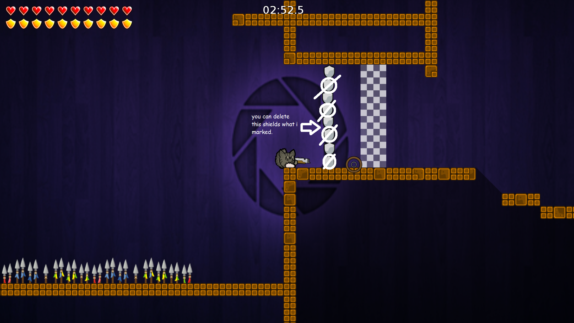
- you dont have to place so much shields.
- Screenshoot 1.png (1.18 MiB) Viewed 3742 times
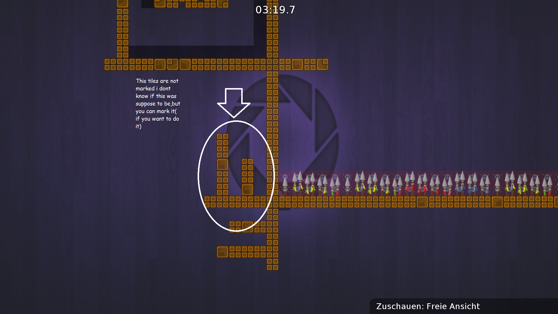
- you can mark it too ( but you dont need it, if you want)
- Screenshoot 2.png (1.16 MiB) Viewed 3742 times
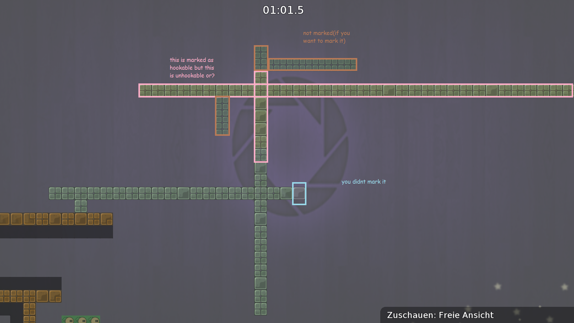
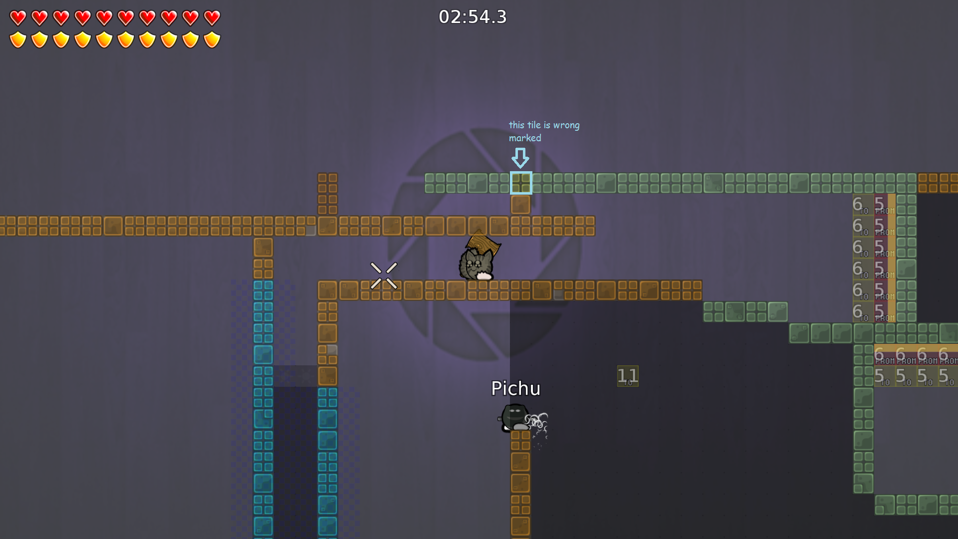
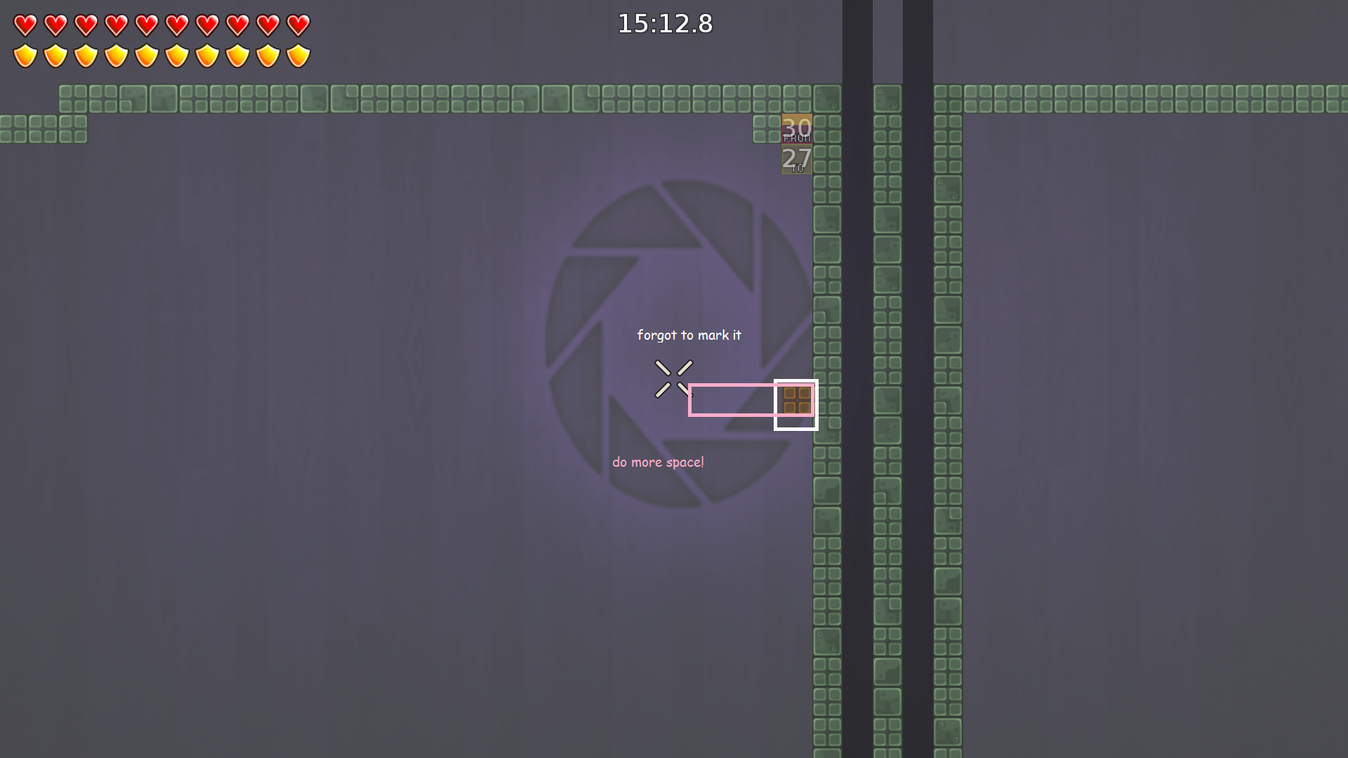
- you need to mark it correctly
- Screenshoot 3.png (771.55 KiB) Viewed 3742 times
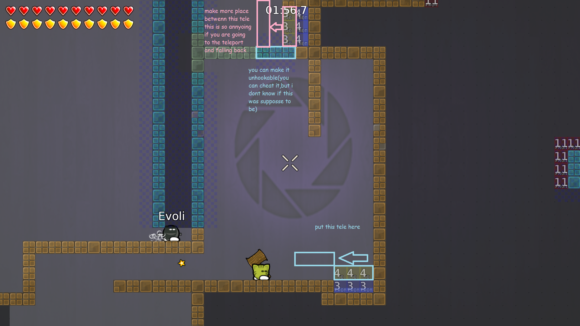
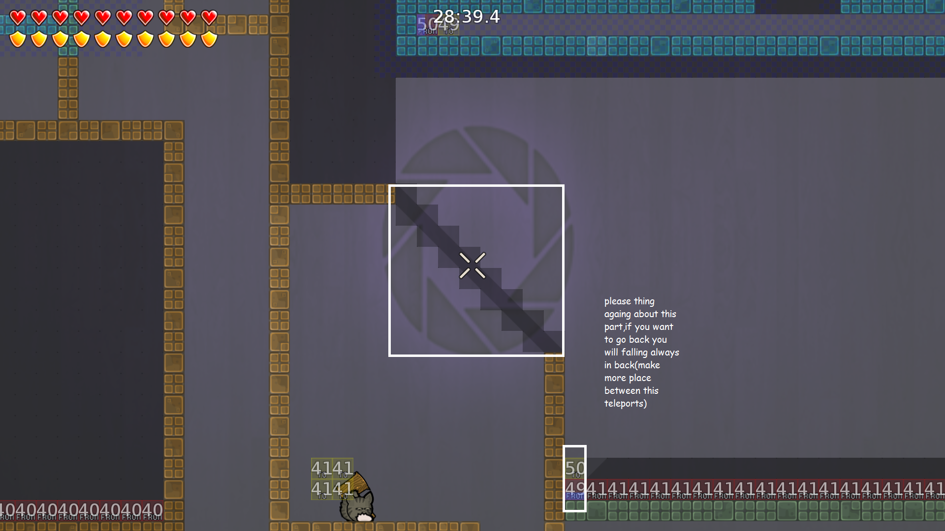
- give this teleports more space between the teleports
- Screenshoot 4.png (980.19 KiB) Viewed 3742 times
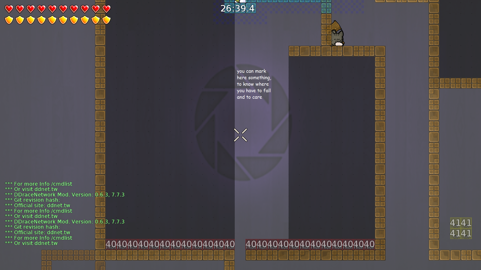
- you forgot to delete here something
- Screenshoot 5.png (1.03 MiB) Viewed 3742 times
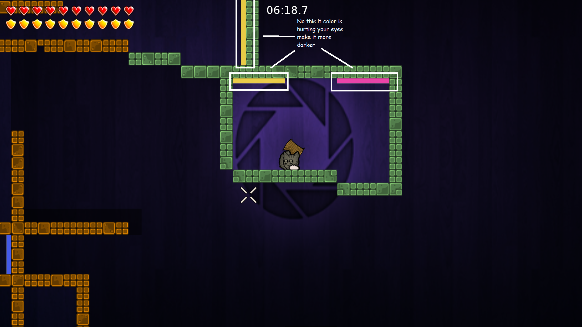
- change the colors or make it darker its dangerous for people who have problems with this colors
- Screenshoot 6.png (1.01 MiB) Viewed 3742 times
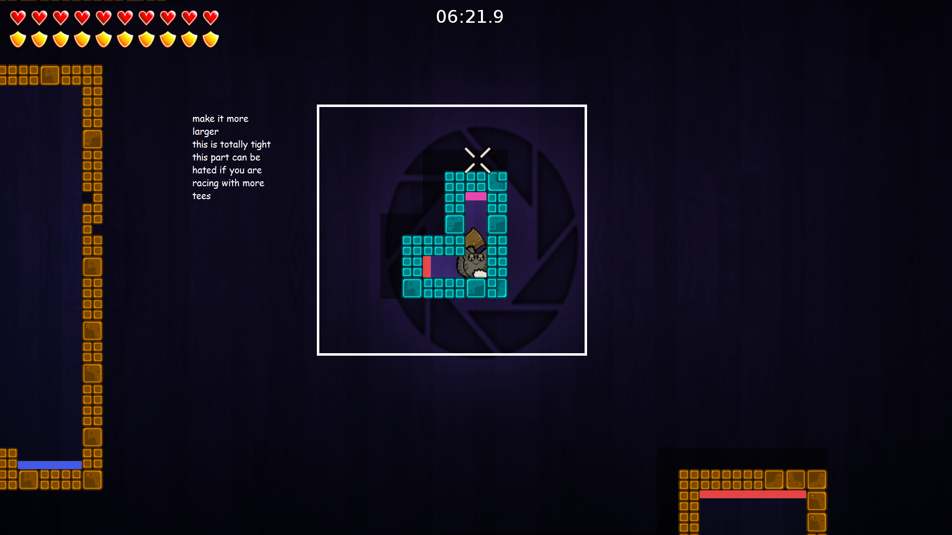
- give this more space, it is so fucking small,
that you would rage, if more tees are blocking this way - Screenshoot 7.png (941.35 KiB) Viewed 3742 times
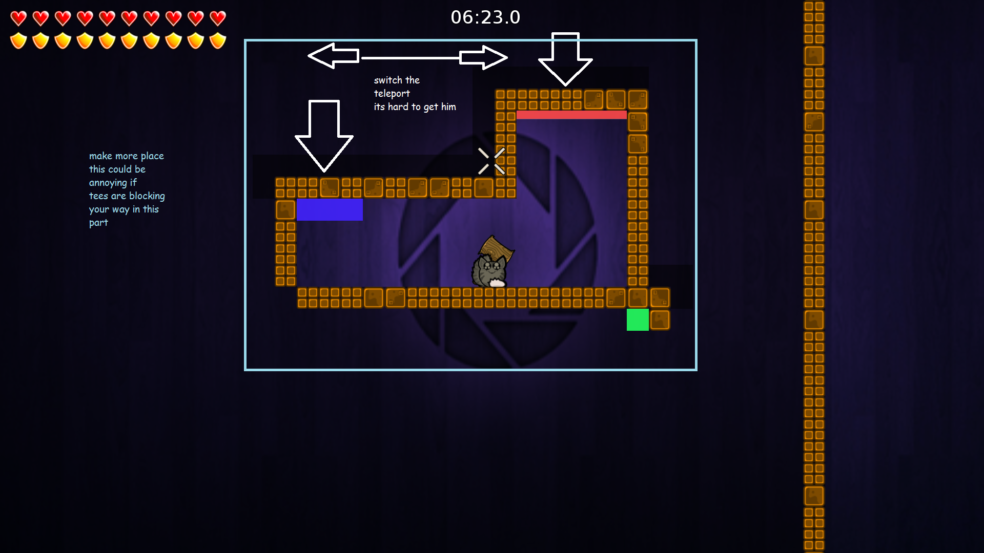
- give this part more space and switch the tele
each other its more better - Screenshoot 8.png (1011.49 KiB) Viewed 3742 times
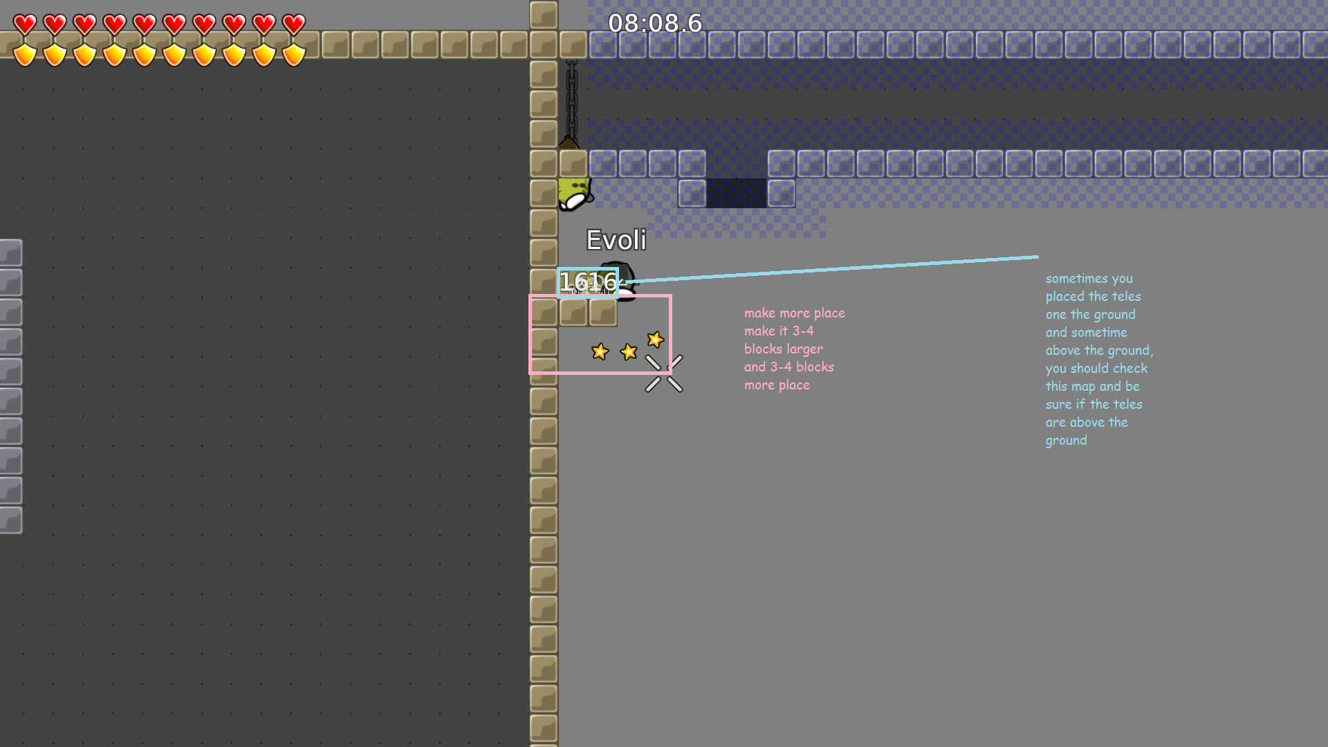
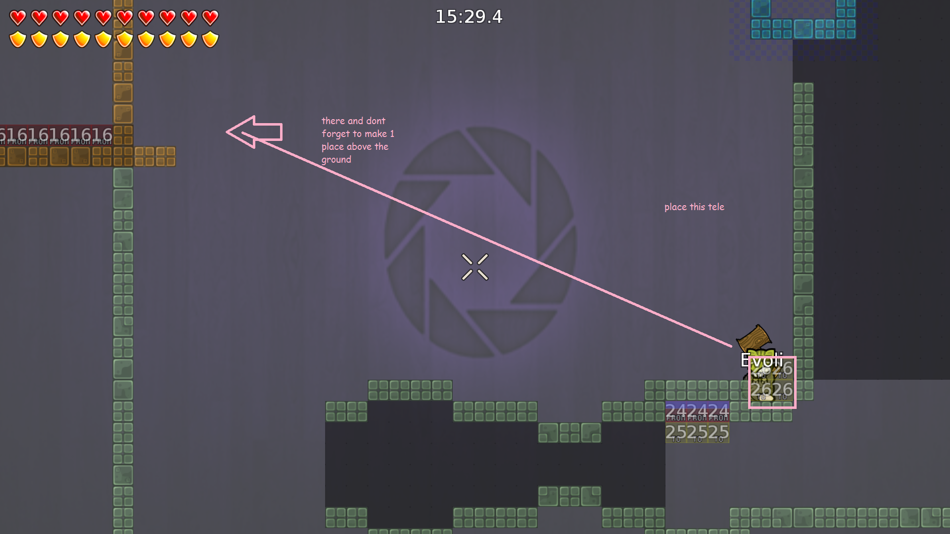
- place the tele one tile about this ground
(do more space/platform - Screenshoot 9.png (251.52 KiB) Viewed 3742 times
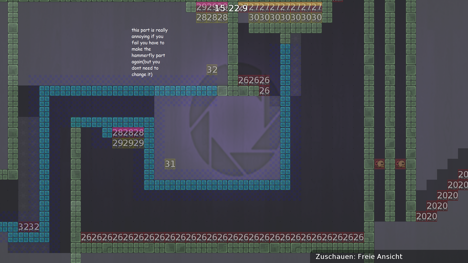
- this part needs more platfrom
- Screenshoot 10.png (1.26 MiB) Viewed 3742 times
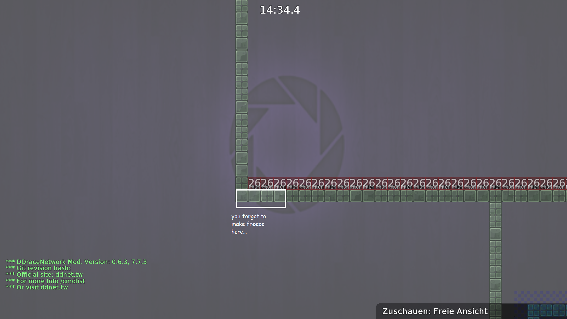
- i dont know if you like it to do freeze after walls
but you forgot to mark it there - Screenshoot 11.png (752.67 KiB) Viewed 3742 times
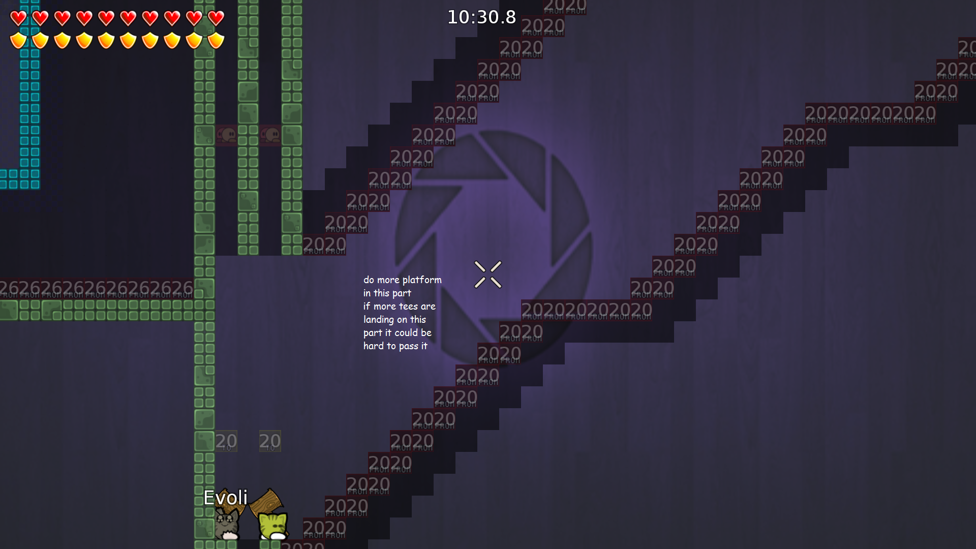
- you forgot to add there hook.
(do more platform) - Screenshoot 12.png (933.94 KiB) Viewed 3742 times
- give this part a chance to like it and not to hate it
- Screenshoot 13.png (1.28 MiB) Viewed 3742 times
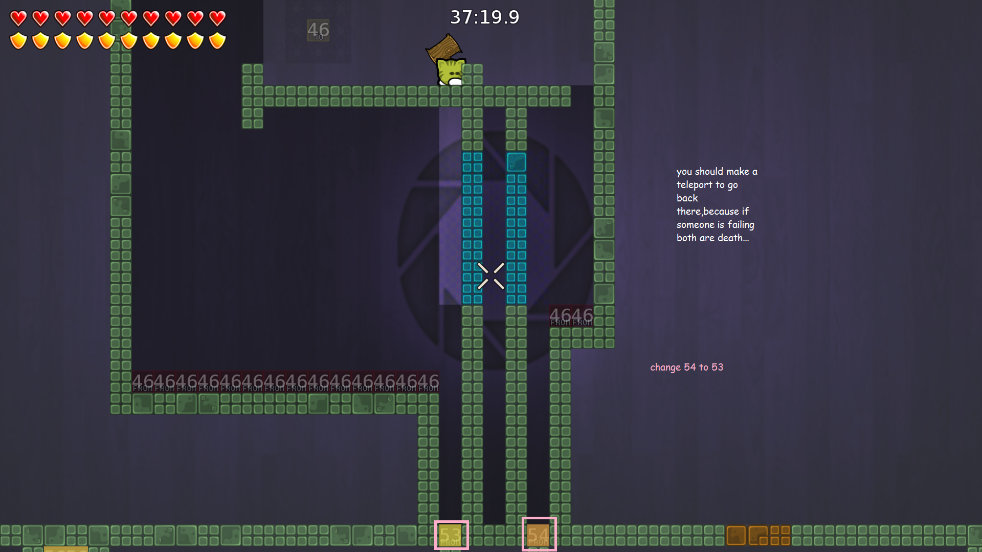
- you should place this teleport somewhere else
- Screenshoot 14.png (998.3 KiB) Viewed 3742 times
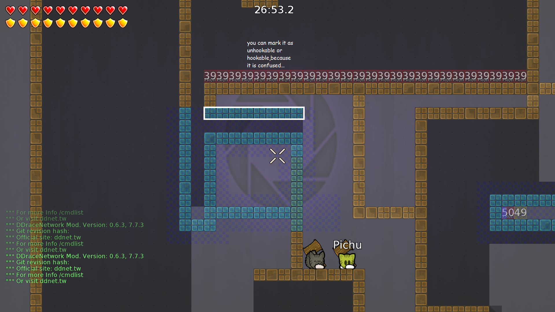
- you should mark here something,because i dont know what this part wants from me.
- Screenshoot 15.png (994.35 KiB) Viewed 3742 times
- do it in other colors,because the players will thing you can hook through( or place there hookthrough,your choice)
- Screenshoot 16.png (1.12 MiB) Viewed 3742 times
- this tele is not good placed, make more space
- Screenshoot 17.png (1018.79 KiB) Viewed 3742 times
- give the tees a chance to go back, like you did it in the other parts
- Screenshoot 18.png (1.19 MiB) Viewed 3742 times
Re: PortalDown
Posted: Sun Jul 05, 2015 4:36 pm
by Deeper
Evoli wrote:So i have tested this map with a dummy, and i must say
you have really nice ideas
to creative parts.
They have a balance between easy-hard parts
this is a perfect moderate map from 2-3 stars.
Keep this mapping you have a brain where you can create really nice parts.
Sadly... this map contains a lot of bugs and some weird looking, where your eyes are hurting.
This map needs more platform and more place, because some parts are so tight that you wont pass it.
this background is to dark with the hole gameplay,if you are playing this map on the day, it is hard to see
where freeze and the teleport are placed.
You can make the background more lighter to get a better look on this parts.
I make some screenshoots what you can
change ( your choice if you want to do it).
thank for test :ь
google.translate
sry for bad english
___________________________
[+] fixed
[-] no fixed
[=] not understand
[*] you do not understand
___________________________[/b]
1 +
2 -
3 +
4 -
5 +
6 +
7 +
8 -,=
9 +
10 +
11 +
12 +
13 +
14 +
15 +
16 =
17 *
18 +
Re: PortalDown
Posted: Fri Jul 10, 2015 5:53 pm
by BamBam
Hmm, pretty good map, quite unbalanced though. Try putting red teles on the portals to make them lose velocity.
I guess make the first part a bit harder as it is like novice 3* now xD. And the colors DO cause eye cancer they are so different and bright, it is not pretty to look at. Try making them all a little darker.

Re: PortalDown
Posted: Sat Jul 11, 2015 10:51 am
by Deeper
Re: PortalDown
Posted: Sat Jul 18, 2015 9:34 pm
by Deeper
not active 1 week
Re: PortalDown
Posted: Tue Jul 21, 2015 6:40 pm
by deen
There are a few strange things to me, like the background not being exactly round (use aspect ratio). Can someone take a final look?
Re: PortalDown
Posted: Tue Jul 21, 2015 8:10 pm
by Ñı©Ø
deen the bg it's not made with different quads, it's just an .png... with the circle thing hardcoded...
Re: PortalDown
Posted: Tue Jul 21, 2015 8:34 pm
by Lady Saavik
and whats the problem with using acept ratio on it?